Avatar & User Components
User profile pictures, initials, status indicators, and user display components for identification and personalization.
Basic Avatars

XS (32px)

SM (40px)
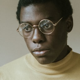
MD (48px)

LG (64px)

XL (80px)
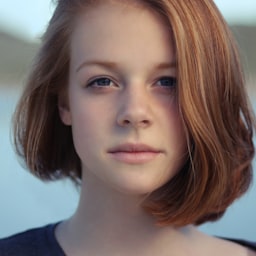
2XL (96px)
<!-- Avatar Sizes -->
<img class="h-8 w-8 rounded-full" src="..." alt=""> <!-- XS -->
<img class="h-10 w-10 rounded-full" src="..." alt=""> <!-- SM -->
<img class="h-12 w-12 rounded-full" src="..." alt=""> <!-- MD -->
<img class="h-16 w-16 rounded-full" src="..." alt=""> <!-- LG -->
<img class="h-20 w-20 rounded-full" src="..." alt=""> <!-- XL -->
<img class="h-24 w-24 rounded-full" src="..." alt=""> <!-- 2XL -->
Avatar with Initials
Blue
Green
Purple
Red
Icon
<!-- Initials Avatar -->
<div class="inline-flex items-center justify-center h-12 w-12 rounded-full bg-blue-500 text-white text-base font-medium">
  JD
</div>

<!-- Icon Avatar -->
<div class="inline-flex items-center justify-center h-12 w-12 rounded-full bg-gray-500 text-white">
  <svg class="h-6 w-6" fill="none" stroke="currentColor" viewBox="0 0 24 24">
    <path stroke-linecap="round" stroke-linejoin="round" stroke-width="2" d="M16 7a4 4 0 11-8 0 4 4 0 018 0zM12 14a7 7 0 00-7 7h14a7 7 0 00-7-7z" />
  </svg>
</div>
Avatar with Status
Online
Away
Busy
Offline
<!-- Avatar with Status -->
<div class="relative">
  <img class="h-12 w-12 rounded-full" src="..." alt="">
  <span class="absolute bottom-0 right-0 block h-3 w-3 rounded-full bg-green-400 ring-2 ring-white dark:ring-gray-800"></span>
</div>
Avatar Groups
Stacked Avatars


Grid Avatars
and 2 others
<!-- Stacked Avatars -->
<div class="flex -space-x-2">
  <img class="inline-block h-10 w-10 rounded-full ring-2 ring-white" src="..." alt="">
  <img class="inline-block h-10 w-10 rounded-full ring-2 ring-white" src="..." alt="">
  <div class="inline-flex items-center justify-center h-10 w-10 rounded-full ring-2 ring-white bg-gray-100 text-xs font-medium text-gray-500">
    +3
  </div>
</div>
User Cards
John Doe
john@example.com
Sarah Miller
Project Manager
AdminAlex Brown
Developer
User List Items
-
Online
John Doe
Owner
-
Sarah Miller
Editor
Away -
BusyAB
Alex Brown
Viewer
Usage Guidelines
Avatar Sizing
- • XS (32px): Use in compact lists, navigation bars, or small UI elements
- • SM (40px): Standard size for most list items and table rows
- • MD (48px): Default size for user cards and dropdown menus
- • LG (64px): Prominent user displays and profile headers
- • XL (80px): Profile pages and user detail views
- • 2XL (96px): Large profile displays and hero sections
Status Indicators
- • Green: Online/available status
- • Yellow: Away or idle status
- • Red: Busy or do not disturb
- • Gray: Offline or inactive status
- • Position status indicators at bottom-right of avatar
- • Use ring-2 ring-white to separate from background
Fallback Patterns
- • Use initials when profile image is unavailable
- • Generate consistent colors based on user name/ID
- • Use generic user icon as final fallback
- • Ensure sufficient color contrast for accessibility
Accessibility
- • Always include meaningful alt text for profile images
- • Use aria-label for initials or icon avatars
- • Ensure status indicators have sufficient color contrast
- • Provide text labels for status when needed
- • Support keyboard navigation for interactive avatars
Best Practices
- • Keep avatar groups to reasonable sizes (5-7 max visible)
- • Use consistent sizing within the same context
- • Optimize images for different display densities
- • Consider loading states for profile images
- • Implement graceful fallbacks for missing images